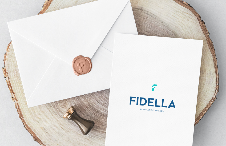
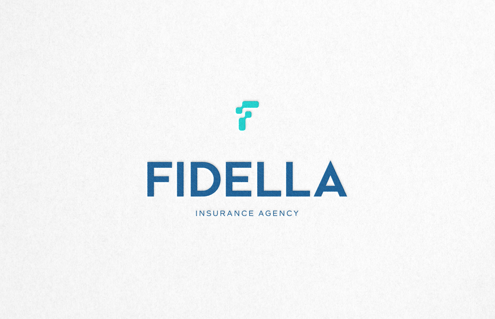
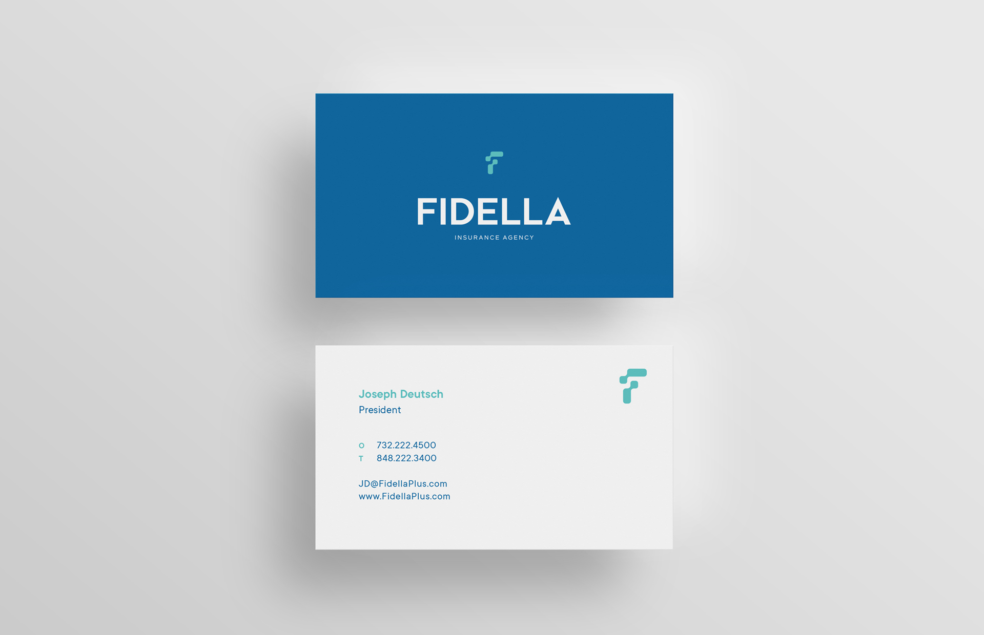
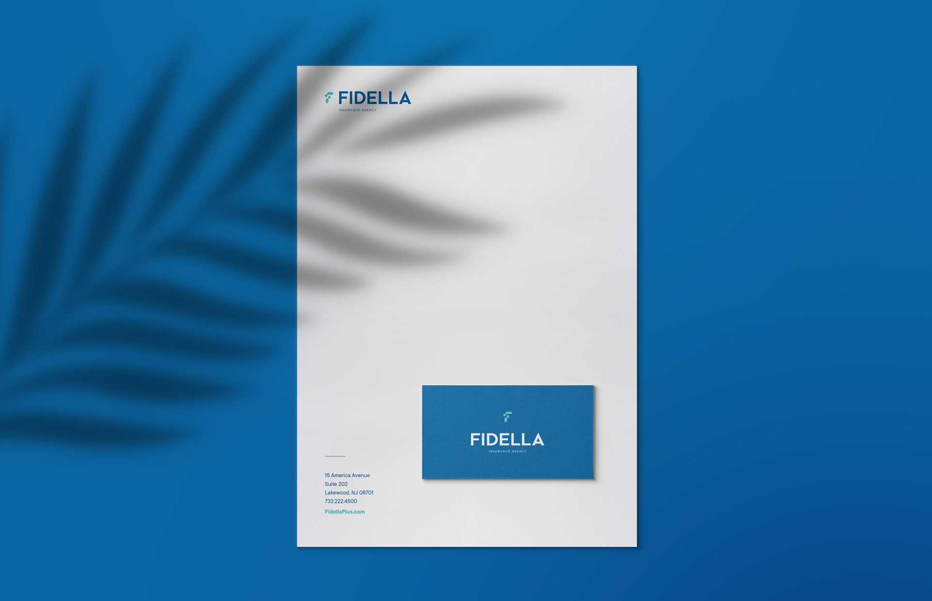
Fidella Insurance Agency, a 10 year old company providing property and casualty insurance for real estate owners, needed to refresh their brand. We created a clean, modern logo that reflects their professionalism and forward-thinking approach.
This minimal yet bold symbol is an abstract letter F that illustrates the principles of Fidella. The two elements join together, with the bottom element supporting the top, for an impression of stability. The top element represents coverage, as it shields and protects the element below. Paired with a sharp, modern typeface and striking color palette, this powerful logo creates a strong and calculated brand presence.
It was time to refresh our brand, and Charna’s sharp designs stood out in my mind. Everything about the work — from the actual design to the colors and fonts — broadcasts uniqueness. Clean design matters to me. They have the same style, so I knew we’d be a good fit. And we were — the project was an all-around great experience. If you’re looking for a clean, neat design, they are the go-to.


 LINKEDIN
Leave a Reply