


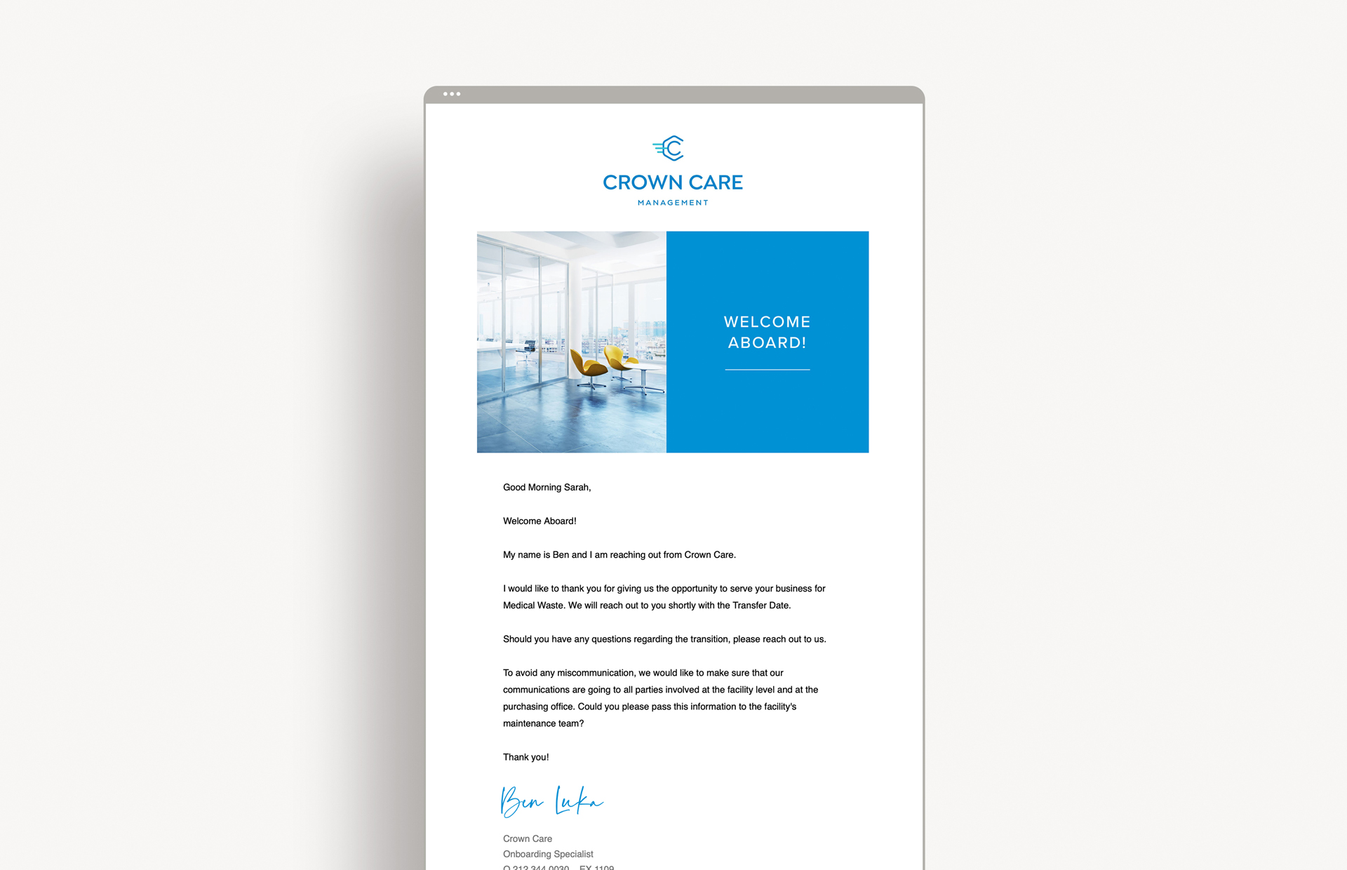
Crown Care Management manages the shredding, medical waste, and document storage services for healthcare companies. They needed to refresh their brand with a clean and contemporary brand image, showcasing their professionalism and approachability.
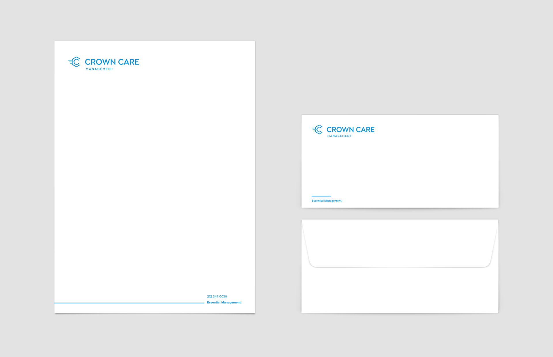
This modern symbol combines a hexagon with a nested circle forming the 2 C’s of Crown Care in an energetic mechanical shape. The lines display motion, representing capability and efficiency, for a forward thinking brand that streamlines services for the benefit of its clients. Rounded edges lend the brand an approachable friendliness, while the layers of meaning exhibit thoughtfulness and establishment. The memorable symbol is paired with a bold symmetrical font and a vibrant blue color palette for a take-charge brand that exudes competence and reliability.


 LINKEDIN
Leave a Reply