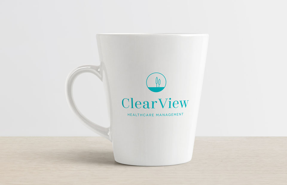
We fashioned the brand identity for ClearView Health Management to reflect the company’s principled vision and approachability.
The nature motif and roundness of the logo indicate wholesomeness and rejuvenation, while the water symbolizes clarity.
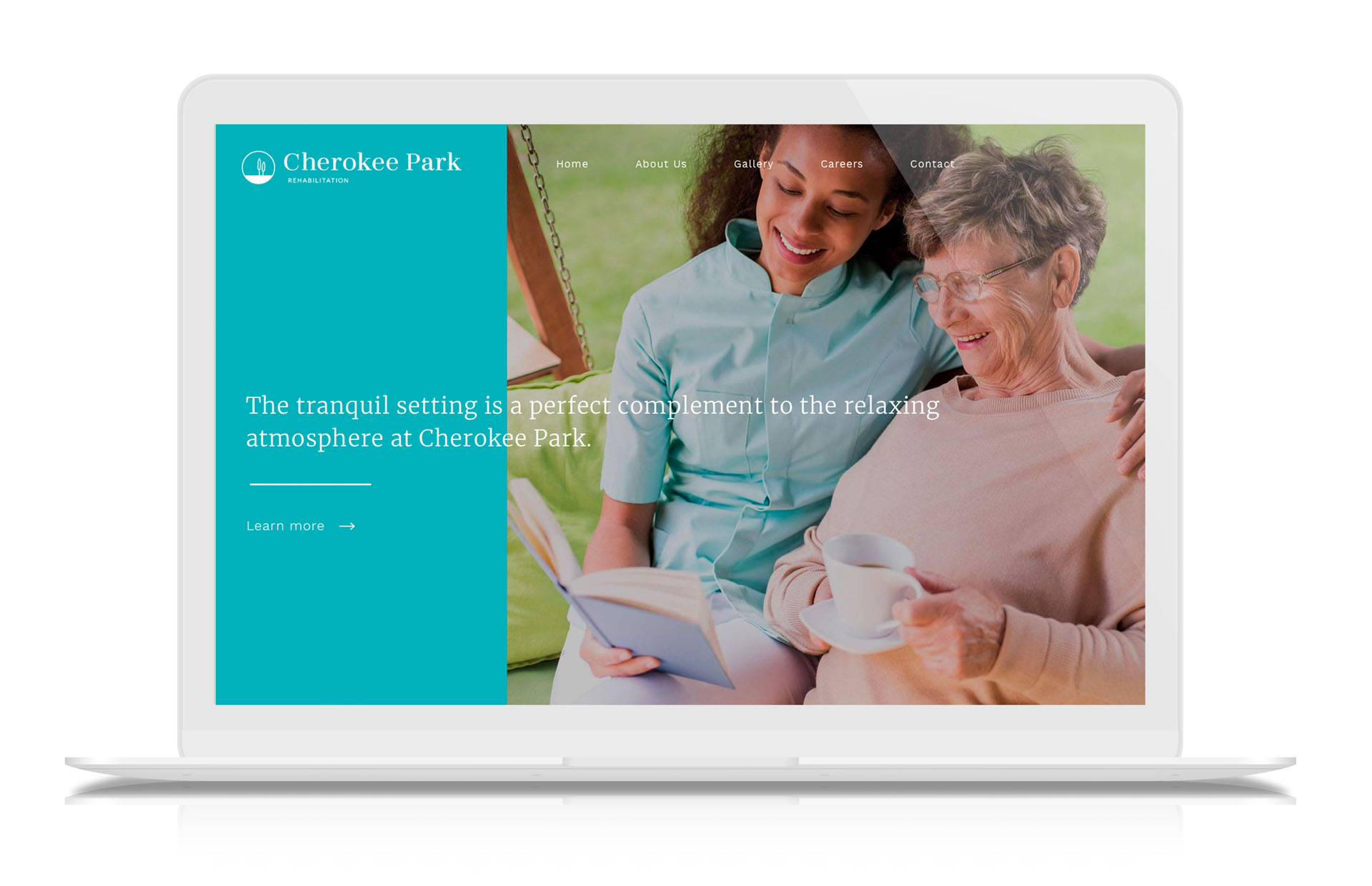
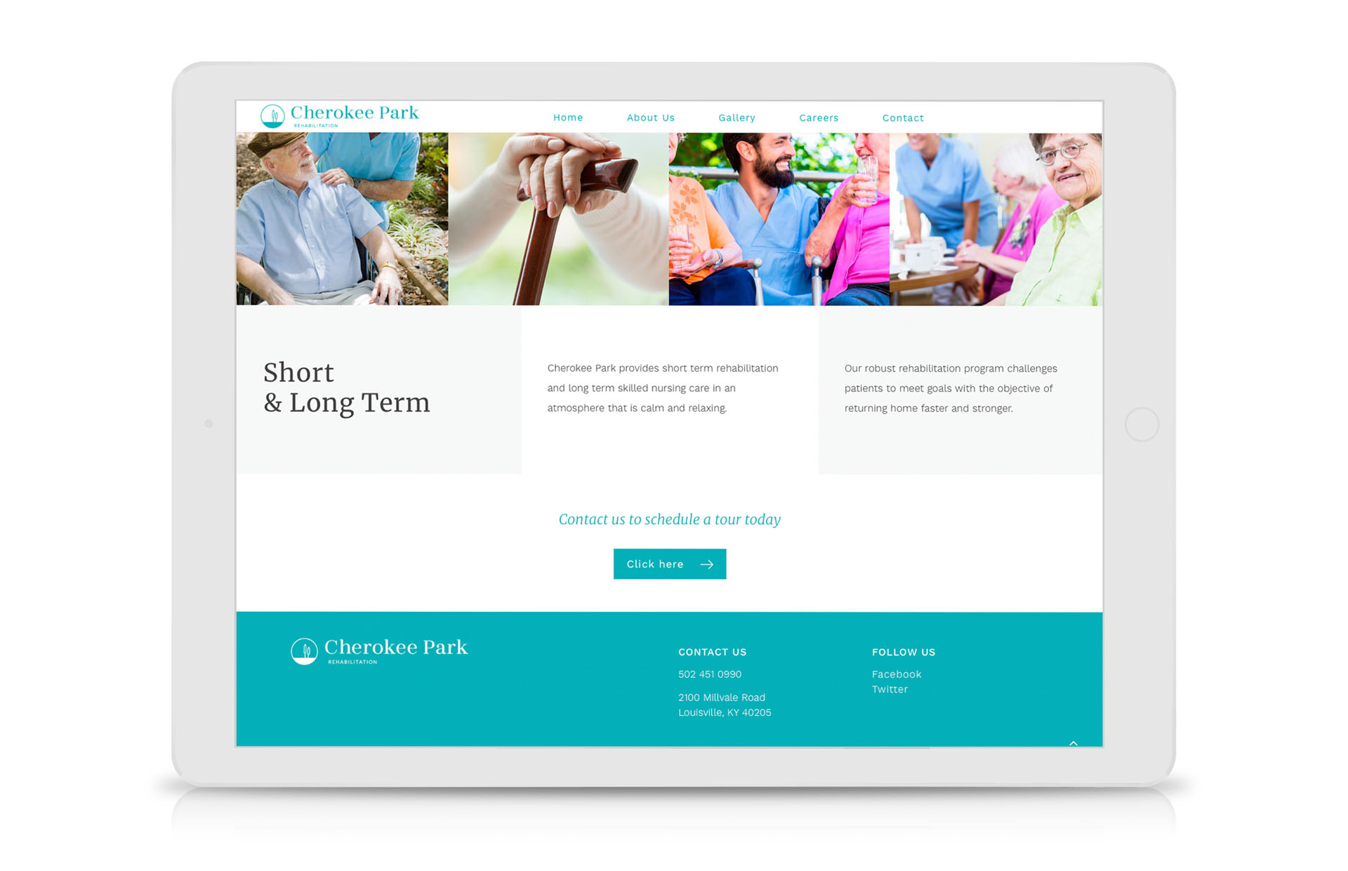
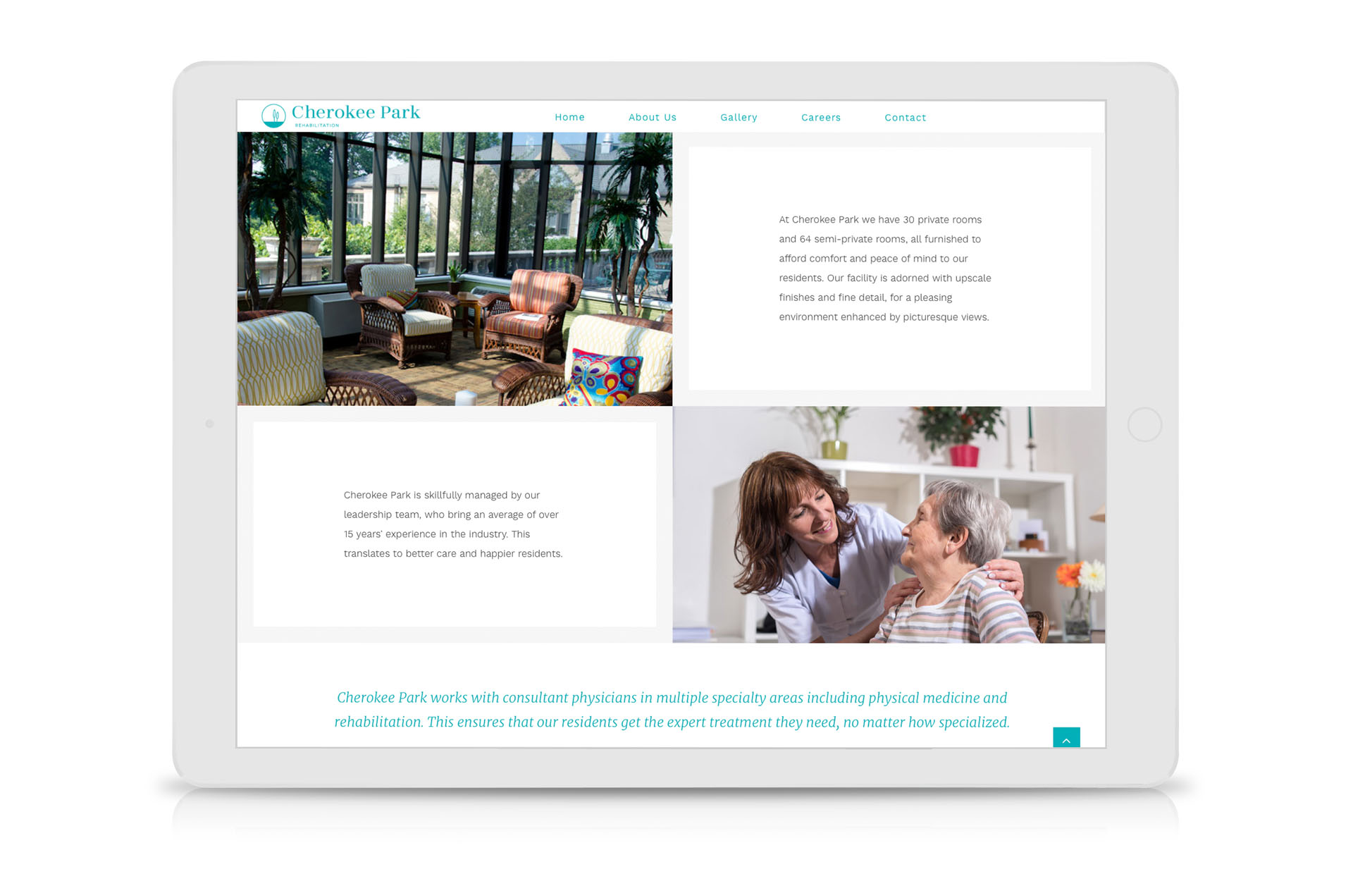
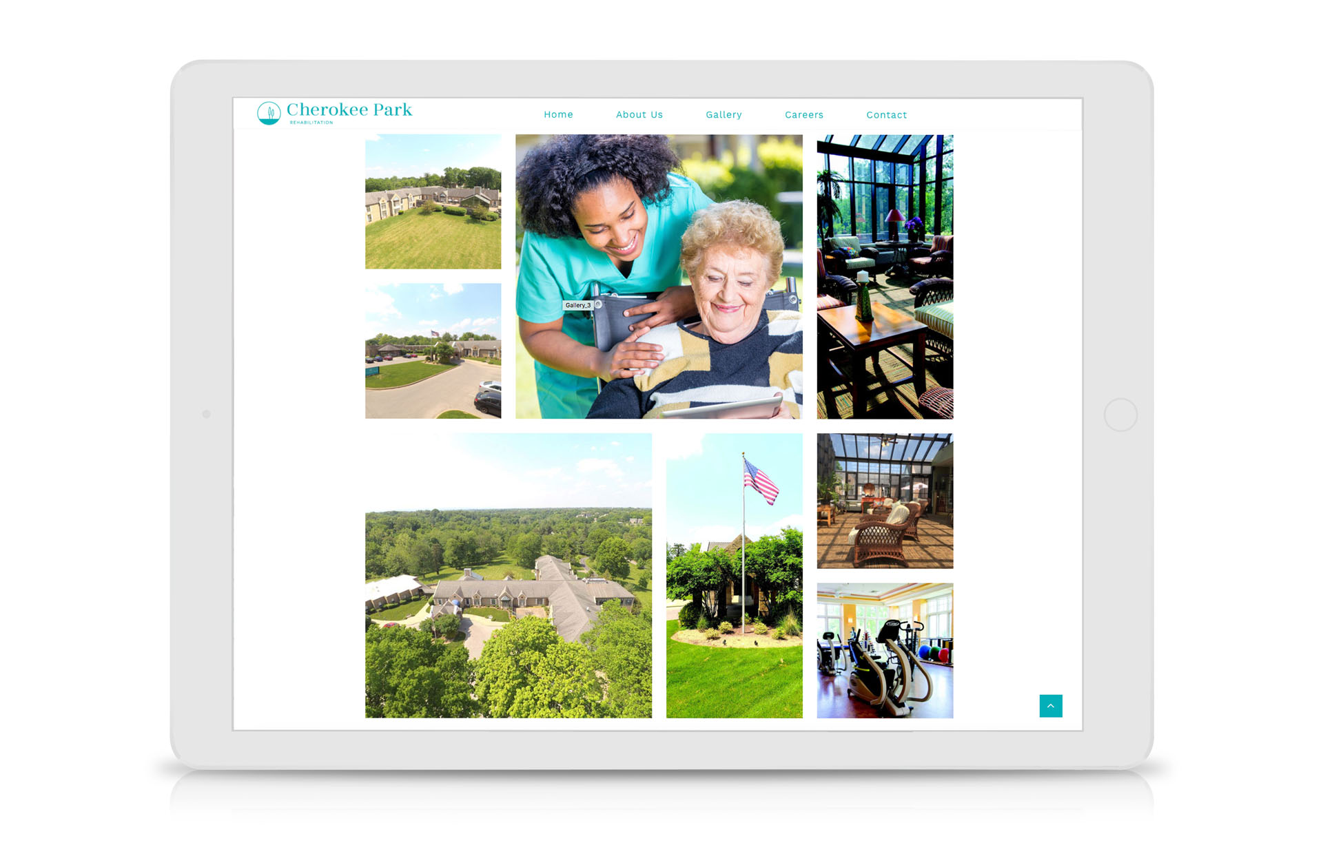
We designed 13 websites that are warm and inviting with a contemporary, modern feel. Bright color radiates positivity and sophisticated typography perfectly complement the ClearView brand. Unique and striking layouts offer a significant edge above others in the industry.
This has been an exceptional work experience. Charna created a stunning new logo for our company, and the entire process was effortless and smooth. Charna is professional, patient and easy to work with. She was efficient and responsive to our needs and handled this project flawlessly.


 LINKEDIN
Leave a Reply